
什麼是 SVG ?
可縮放向量圖形(Scalable Vector Graphics)是一種基於 XML 標準,用於描述二維向量圖形的格式。由於自由縮放而不失真的特性,使得 SVG 特別適合用於 Responsive Web Design。
SVG 的優點
- 縮放性:不同於 PNG、JPEG 這些點陣圖像,SVG 可以無損地進行放大或縮小。因為它並非使用像素,而是透過數學式的計算來描述圖像內容,因此向量圖形格式不會有圖像解析度的問題存在。
- 容易修改:SVG 是文字描述的圖檔,可讀性增加,因此易於修改和編輯(理論上如此,和實際使用的 SVG 編輯器有關)。
- 互動性:SVG 檔案可以嵌入 JavaScript 或 CSS,以實現動畫效果、事件處理等。
- 圖形元素多樣:SVG 支持矩形、圓形、橢圓、路徑等,運用這些元素可以組合出複雜的圖形。
- 濾鏡效果:SVG 也支持模糊、陰影、色彩轉換等濾鏡,可以在不改變圖像內容的前提下實現類似文字陰影的效果。
- 可做動畫:SVG 也能製作動畫,可以透過 CSS 或 SMIL 來實現,這些動畫描述語法非常高效,因此所需的額外數據量很少。以相同的動畫效果來說,SVG 動畫的文件大小會比逐幀儲存的 GIF 動畫來得小,但僅限於圖形簡單的動畫。
⚠️不同於點陣圖,向量圖的圖像內容是透過數學式計算出來的。所以 SVG 不適合用於細節繁瑣的圖像,否則其運算的速度會變得很慢,檔案的大小也會非常龐大。因此,如果需要呈現畫面複雜的圖片,建議還是使用 PNG、JPEG 等格式就好。
繪製 SVG
編寫 SVG 需要注意的幾項規則:
- 從根元素
<svg>開始,並以width與height屬性定義圖像的尺寸 - 由於 SVG 是基於 XML,所以請保留定義 SVG 區段的命名空間,也就是
xmlns="http://www.w3.org/2000/svg"
SVG 標籤
SVG 有以下基礎圖形供開發人員使用:
- 矩形
<rect> - 圓形
<circle> - 橢圓
<ellipse> - 線段
<line> - 折線
<polyline> - 多邊形
<polygon> - 路徑
<path>
矩形
矩形元素 <rect> 包含以下六個基本屬性:
| 屬性 | 說明 |
|---|---|
| width | 定義矩形的寬度 |
| height | 定義矩形的高度 |
| x | 矩形左上角的 x 座標 |
| y | 矩形左上角的 y 座標 |
| rx | 矩形圓角的 x 半徑 |
| ry | 矩形圓角的 y 半徑 |
以下是一個範例:
<svg width="300" height="130" xmlns="http://www.w3.org/2000/svg">
  <rect id="myRectangle" width="200" height="100" x="10" y="10" rx="20" ry="20" stroke="ivory" stroke-width="10" fill="violet" />
</svg>
畫出來的圖形會長這樣:

其他屬性說明:
id:圖形的名稱stroke:輪廓顏色stroke-width:輪廓寬度fill:圖形的填充顏色opacity:圖形的透明度
圓形
圓形元素 <circle> 包含以下三個基本屬性:
| 屬性 | 說明 |
|---|---|
| r | 定義圓的半徑 |
| cx | 圓心的 x 座標 |
| cy | 圓心的 y 座標 |
範例:
<svg height="100" width="100" xmlns="http://www.w3.org/2000/svg">
    <circle id="greenBall" r="30" cx="40" cy="30" fill="green" opacity="0.5" />
    <circle id="pinkBall" r="20" cx="60" cy="40" fill="pink" opacity="0.5" />
</svg>
呈現結果:

橢圓
橢圓元素 <ellipse> 包含以下四個基本屬性:
| 屬性 | 說明 |
|---|---|
| rx | 定義橢圓的 x 半徑 |
| ry | 定義橢圓的 y 半徑 |
| cx | 圓心的 x 座標 |
| cy | 圓心的 y 座標 |
範例:
<svg height="300" width="500" xmlns="http://www.w3.org/2000/svg">
  <ellipse id="bigEllipse" cx="240" cy="100" rx="220" ry="80" fill="cyan" />
  <ellipse id="smallEllipse" cx="160" cy="110" rx="130" ry="50" fill="navy" />
</svg>
呈現結果:

線段
線段元素 <line> 包含以下四個基本屬性:
| 屬性 | 說明 |
|---|---|
| x1 | 線段起點的 x 座標 |
| x2 | 線段起點的 y 座標 |
| y1 | 線段終點的 x 座標 |
| y2 | 線段終點的 y 座標 |
範例:
<svg height="200" width="300" xmlns="http://www.w3.org/2000/svg">
  <line id="slash" x1="0" y1="0" x2="300" y2="200" stroke="yellow" stroke-width="2" />
  <line id="horizontal" x1="0" y1="20" x2="300" y2="20" stroke="red" stroke-width="2" />
  <line id="vertical" x1="100" y1="0" x2="100" y2="200" stroke="blue" stroke-width="2" />
</svg>
呈現結果:

折線
折線元素 <polyline> 基本上只有 points 這個屬性,用於描述每個點的座標。
範例:
<svg height="400" width="400" xmlns="http://www.w3.org/2000/svg">
  <polyline id="randomPolyline" points="0,0 50,130 100,25 150,50 200,140 250,120" fill='none' stroke='turquoise' stroke-width='5'/>
  <polyline id="steppedPolyline" points="60 ,160 60, 160 60, 200 100, 200 100, 240 140, 240 140, 280 180, 280 180, 320 220, 320 220" fill='salmon' stroke='silver' stroke-width='5' />
</svg>
呈現結果:

多邊形
多邊形元素 <polygon> 和折線一樣,基本上只有 points 這個屬性。與折線不同的是,多邊形的最後一個點會自動連接第一個點。
範例:
<svg height="500" width="800" xmlns="http://www.w3.org/2000/svg">
  <polygon id="hexagon" points="150,15 258,77 258,202 150,265 42,202 42,77" fill="springgreen" />
  <polygon id="triangle" points="320 40, 320 100, 400 70" fill="crimson" />
  <polygon id="square" points="420, 20, 500, 20, 500, 100, 420, 100" fill="gold" />
  <polygon id="pentagon" points="600, 50, 650, 100, 625, 150, 575, 150, 550, 100" fill="skyblue" />

  <polygon id="star" points="300,200 240,398 390,278 210,278 360,398" fill="steelblue" />
  <polygon id="anotherStar" points="500,200 442,380 586,270 404,270 558,380" fill="tomato" fill-rule="evenodd" />
</svg>
呈現結果:

ℹ️ Polygon 有個特別的屬性 fill-rule ,詳細用法請參考這裡。
路徑
路徑元素 <path> 是非常強大的工具,它有許多指令,用來定義路徑以完成複雜的圖形,也有繪製貝斯曲線功能。也因為如此,path 是個非常困難的功能,通常不太可能親手刻,而是透過 SVG Editor 等編輯工具完成。
基本屬性介紹:
| 屬性 | 說明 |
|---|---|
| M | 起點座標 |
| L | 從當前點畫直線到指定點 |
| H | 從當前點畫水平直線到指定的 x 軸座標 |
| V | 從當前點畫垂直直線到指定的 y 軸座標 |
| C | 從當前點畫貝茲曲線到指定點 |
| S | 從當前點畫反射的貝茲曲線到指定點 |
| Q | 從當前點畫兩次貝茲曲線到指定點 |
| T | 從當前點畫反射的兩次貝茲曲線到指定點 |
| A | 畫橢圓圓弧 |
| Z | 關閉路徑,連回起點 |
文字
SVG 也支援文字,使用 <text> 元素
範例:
<svg height="80" width="300" xmlns="http://www.w3.org/2000/svg">
  <text id="line1" x="10" y="15" fill="lightpink" font-size='16'>Let's learn SVG</text>
  <text id="line2" x="10" y="35" fill="none" stroke="lightblue" stroke-width="0.4" font-size='16'>and have some fun!</text>
  <text id="line3" x="10" y="55" fill="lightgreen" rotate="20" textLength='200' font-size='16'>It's easy and cool!</text>
  <text id="line4" x="10" y="75" fill="lightgray" font-size='16'>
    Let's
    <tspan fill="lightcoral">do it!</tspan>
  </text>
</svg>
呈現結果:

<defs>
這個標籤是用來包裝重複性的元素,可以包裝圖形、色彩和遮罩等,在 SVG 中是不可或缺的元素。例如以下這個圖形:

我們可以將重複出現的 <circle> 和 <rect> 用 <g> 組合成群組,再將整個圖形用 <defs> 包裝起來,改寫成以下這樣:
<svg height="80" width="150" xmlns="http://www.w3.org/2000/svg">
    <defs>
        <g id="stop-sign">
          <circle cx="40" cy="40" r="30" fill="red" stroke="white" stroke-width="5" />
          <rect x="25" y="38" width="30" height="5" fill="white" />
        </g>
    </defs>

    <use href="#stop-sign" x="0" y="0" />
    <use href="#stop-sign" x="70" y="0" />
</svg>

SVG 屬性
Viewport & ViewBox
viewport 是 SVG 圖像的顯示區域,定義了 SVG 的大小和位置。通過 width 和 height 屬性來設置。可以把 viewport 想像成是一個「相框」。
以下是一個 viewport 大小為 200x200 像素的例子:
<svg width="200" height="200">
  <!-- SVG Element -->
</svg>
viewBox 屬性則是定義 SVG 圖像的坐標和縮放行為。使用 min-x、min-y、width、height 這四個值來描述。這些值決定了內容的可見區域和其比例,可以把 viewBox 想像是一個「相片」。其語法如下:
<svg width="200" height="300" viewBox="0 0 100 150">
  <!-- SVG 内容 -->
</svg>
在這個例子中,viewBox 設置為 0 0 100 100 ,對應 min-x min-y width height,表示一個以 (0,0) 作為起點,寬度延伸 100,高度 150 的區域。而這個 100x150 的區域將縮放到 200x300 的 viewport 中。
更多動畫範例請參考以下連結:
- SVG 研究之路 (23) - 理解 viewport 與 viewbox
- [技術分享] 理解 SVG 中的 Viewport 和 ViewBox-拖曳與縮放功能實做(上)
- SVG Viewport and viewBox (For Complete Beginners)
總結:
viewport定義 SVG 的尺寸,viewBox定義內容的縮放- 當
viewBox和viewport一樣大,相片會完整貼合相框 - 當
viewBox比viewport小,圖像會被裁切,相片有放大的效果 - 當
viewBox比viewport大,圖像會被縮小
Stroke
輪廓 stroke 的相關屬性有六種:
stroke:設定輪廓顏色stroke-width:設定輪廓線條的寬度stroke-opacity:設定輪廓的不透明度stroke-linecap:設定輪廓的形狀stroke-dasharray:設定虛線stroke-linejoin:設定兩條線相交處的角落形狀
範例:
<svg height="300" width="300" xmlns="http://www.w3.org/2000/svg">
    <g fill='white' stroke="red" stroke-width="4">
      <circle id="opacity1line" r="10" cx="40" cy="20" stroke-opacity="1" />
      <circle id="opacity1line" r="10" cx="80" cy="20" stroke-opacity="0.5" />
    </g>
    <g stroke="green" stroke-width="4">
      <line id="buttLinecap" x1="10" y1="40" x2="200" y2="40" stroke-linecap="butt" />
      <line id="roundLinecap" x1="10" y1="50" x2="200" y2="50" stroke-linecap="round" />
      <line id="squareLinecap" x1="10" y1="60" x2="200" y2="60" stroke-linecap="square" />
    </g>
    <g stroke="blue" stroke-width="4" fill="none">
      <circle id="dashLine1" r="20" cx="35" cy="90" stroke-dasharray="3" />
      <circle id="dashLine2" r="20" cx="90" cy="90" stroke-dasharray="4,10" />
      <circle id="dashLine3" r="20" cx="145" cy="90" stroke-dasharray="10,2,3,4,5" />
    </g>
    <g fill="none" stroke="yellow" stroke-width="4">
      <rect id="miter" width="50" height="50" x="10" y="120" stroke-linejoin="miter" />
      <rect id="round" width="50" height="50" x="70" y="120" stroke-linejoin="round" />
      <rect id="bevel" width="50" height="50" x="130" y="120" stroke-linejoin="bevel" />
    </g>
</svg>
呈現結果:

Fill
SVG 支援的填色 fill 方法包括純色和漸層。前面已經有不少純色的例子提供參考,所以接下來的說明以漸層為主:
stop offset:設定填色的比例,數值在 0% ~ 100% 內stop stop-opacity:設定透明度,數值在 0 ~ 1 內linearGradient:線型漸層,使用 `x1, y1, x2, y2` 定義漸層位置radialGradient:放射漸層,使用 `cx, cy, r` 定義漸層位置與範圍(半徑)
線型漸層 <linearGradient> :
<svg width="440" height="210" xmlns="http://www.w3.org/2000/svg">
  <defs>
    <linearGradient id="line1" x1="0" y1="0" x2="0" y2="1">
      <stop offset="0%" stop-color="red"></stop>
      <stop offset="100%" stop-color="blue"></stop>
    </linearGradient>
    <linearGradient id="line2" x1="0" y1="0" x2="1" y2="0">
      <stop offset="0%" stop-color="green"></stop>
      <stop offset="100%" stop-color="green" stop-opacity="0"></stop>
    </linearGradient>
  </defs>

    <rect width="200" height="200" x="0" y="0" fill="url(#line1)" stroke="white" stroke-width="4"></rect>
    <rect width="200" height="200" x="230" y="0" fill="url(#line2)" stroke="white" stroke-width="4"></rect>
</svg>
呈現結果:

放射漸層 <radialGradient> :
<svg width="440" height="210" xmlns="http://www.w3.org/2000/svg">
  <defs>
    <radialGradient id="radial1" cx="0.5" cy="0.5" r="0.5">
      <stop offset="0%" stop-color="red"></stop>
      <stop offset="100%" stop-color="blue"></stop>
    </radialGradient>
    <radialGradient id="radial2" cx="1" cy="1" r="1">
      <stop offset="0%" stop-color="green"></stop>
      <stop offset="100%" stop-color="green" stop-opacity="0"></stop>
    </radialGradient>
  </defs>

    <rect width="200" height="200" x="0" y="0" fill="url(#radial1)" stroke="white" stroke-width="4"></rect>
    <rect width="200" height="200" x="230" y="0" fill="url(#radial2)" stroke="white" stroke-width="4"></rect>
</svg>
呈現結果:

SVG 濾鏡
<filter> 需要在 <defs> 裡定義使用,常見的屬性如下:
| 屬性 | 說明 |
|---|---|
| width | 定義濾鏡的寬度 |
| height | 定義濾鏡的高度 |
| x | 濾鏡左上角的 x 座標 |
| y | 濾鏡左上角的 y 座標 |
| filterUnits | 定義採用的座標系,預設為 userSpaceOnUse 。userSpaceOnUse 表示濾鏡的座標會基於整個 SVG 來計算;設定 objectBoundingBox 時則是基於元素自身的邊界框 |
userSpaceOnUse 的範例,因為濾鏡的座標是基於整個 SVG 來計算的,所以只涵蓋了一小塊:

objectBoundingBox 的範例,因為濾鏡的座標以套用元素的邊界計算,所以看起來是一大片:

由於多數濾鏡效果在 Chrome、Firefox、Safari 等瀏覽器上實測不佳,所以這裡只介紹兩個常用的濾鏡:
模糊
模糊濾鏡 <feGaussianBlur> 只有一個屬性 stdDeviation ,數值越大就越模糊。設定兩個數值的話則可以實現橫向或縱向模糊 (x,y)。
<svg width="200" height="200" xmlns="http://www.w3.org/2000/svg">
  <defs>
    <filter
        id="myFilter"
        filterUnits="objectBoundingBox"
        x="0"
        y="0"
        width="100"
        height="100"
    >
      <feGaussianBlur in="SourceGraphic" stdDeviation="5" />
    </filter>
  </defs>

  <g filter="url(#myFilter)">
    <rect x="10" y="10" width="180" height="180" fill="blue" />
    <circle cx="100" cy="100" r="50" fill="white" />
  </g>
</svg>
投影
投影濾鏡 <feDropShadow> 類似 CSS 的 drop-shadow ,有以下幾種屬性:
| 屬性 | 說明 |
|---|---|
| stdDeviation | 模糊的大小,可以設定 (x,y) 實現橫向或縱向模糊 |
| dx | 水平偏移量 |
| dy | 垂直偏移量 |
| flood-color | 投影的填充顏色 |
| flood-opacity | 投影的透明度 |
<svg width="300" height="100" xmlns="http://www.w3.org/2000/svg">
  <defs>
    <filter id="shadow">
       <feDropShadow dx="8" dy="8" stdDeviation="1" flood-opacity="0.7"/>
    </filter>
    <filter id="shadow2">
      <feDropShadow dx="0" dy="0" stdDeviation="3" flood-color="cyan" />
    </filter>
    <filter id="shadow3">
      <feDropShadow
        dx="-8"
        dy="-8"
        stdDeviation="0"
        flood-color="pink"
        flood-opacity="0.5" />
    </filter>
  </defs>

  <circle cx="40" cy="50" r="40" fill="pink" filter="url(#shadow)" />
  <circle cx="140" cy="50" r="40" fill="pink" filter="url(#shadow2)" />
  <circle cx="240" cy="50" r="40" fill="pink" filter="url(#shadow3)" />
</svg>

SVG 動畫
SVG 的動畫元素應該放置在需要應用動畫效果的元素內部,總共有 <set> 、<animate> 、<animateMotion>、<animateTransform> 四種,接下來將一一介紹:
<set>
在指定的時間後改變某個 SVG 屬性。不過 <set> 和其他動畫不一樣,它只會執行一次,而且沒有補間效果。
<set> 有以下屬性:
| 屬性 | 說明 |
|---|---|
| attributeName | 要變更的屬性 |
| to | 變更的值 |
| begin | 開始執行的時間 |
<svg width="200" height="200" xmlns="http://www.w3.org/2000/svg">
    <circle cx="100" cy="100" r="25" fill="red">
        <set attributeName="r" to="50" begin="3s" />
    </circle>
</svg>

💡 如果沒有看到放大效果,可以在新分頁中開啟圖片重新播放動畫
<animate>
常見的 SVG 動畫,用於對指定的單一屬性進行動畫處理。它會在起點和終點之間補間,並且可以指定播放次數。
| 屬性 | 說明 |
|---|---|
| attributeName | 要變更的屬性 |
| begin | 開始執行的時間 |
| from | 起始值 |
| to | 結束值 |
| dur | 動畫持續時間 |
| repeatCount | 播放次數 |
| values | 非必要。定義一組中間值,允許動畫在多個值之間進行變化,如果有 value,則 from 和 to 的值會被忽略。 |
| keyTimes | 非必要。提供精細控制動畫進行的時間點。 |
<svg width="300" height="50" xmlns="http://www.w3.org/2000/svg">
    <rect x="0" y="0" width="50" height="50" fill="red">
        <animate
            attributeName="x"
            begin="0s"
            dur="2s"
            from="-30"
            to="100%"
            repeatCount="indefinite"
            />
    </rect>
</svg>

<animateTransform>
專門用來控制 transform 屬性(translation、scale、rotate、skew 等)的動畫處理。
| 屬性 | 說明 |
|---|---|
| attributeName | 一般設定為 transform ,因為此元素是針對 transform 屬性 |
| type | 指定類型,可以是 translate、scale、rotate 或 skewX、skewY |
| begin | 開始執行的時間 |
| from | 起始值 |
| to | 結束值 |
| dur | 動畫持續時間 |
| repeatCount | 播放次數 |
| values | 非必要。定義一組中間值,允許動畫在多個值之間進行變化,如果有 value,則 from 和 to 的值會被忽略。 |
| keyTimes | 非必要。提供精細控制動畫進行的時間點。 |
<svg width="100" height="100" xmlns="http://www.w3.org/2000/svg">
    <rect x="25" y="25" width="50" height="50" fill="red">
        <animateTransform attributeName="transform" type="rotate" from="0 50 50" to="360 50 50" dur="10s" repeatCount="indefinite" />
    </rect>
</svg>

<animateMotion>
讓 SVG 元素沿著路徑移動。
| 屬性 | 說明 |
|---|---|
| path | 定義路徑 |
| begin | 開始執行的時間 |
| dur | 動畫持續時間 |
| repeatCount | 播放次數 |
| rotate | 控制元素是否隨著路徑旋轉 |
<svg width="400" height="400" xmlns="http://www.w3.org/2000/svg">
  <!-- 地圖路徑 -->
  <path id="myPath" fill="none" stroke="red" stroke-width="4"
        d="M200,300
           C100,200 100,100 200,100
           C300,100 300,200 200,300
           Z" />

  <!-- 移動箭頭 -->
  <path d="M0,0 L10,5 L0,10 L3,5 Z" fill="blue">
    <animateMotion dur="5s" repeatCount="indefinite" rotate="auto">
      <mpath href="#myPath" />
    </animateMotion>
  </path>
</svg>

其他瀏覽器和設備對 SVG 的支援程度
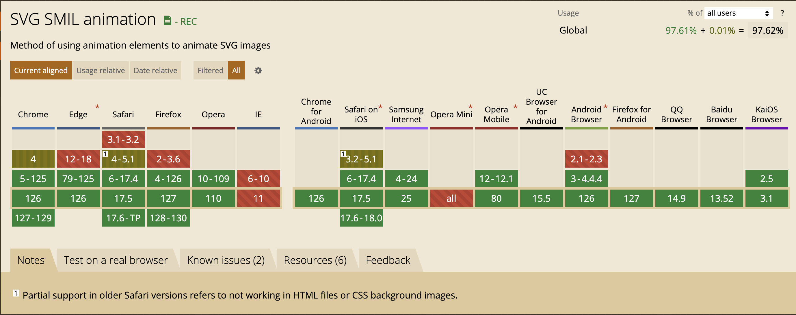
總結
- 基本 SVG 特性:幾乎所有現代瀏覽器(包括桌面和行動裝置上的瀏覽器)都完全支持基本的 SVG 特性,例如形狀、路徑、填充、漸變、遮罩和裁剪路徑。
- SMIL 動畫:對於 SMIL 動畫的支持存在較大差異:
- 支援 SMIL 動畫:包括大多數桌面瀏覽器(如 Chrome、Firefox)和 Android 設備上的 Chrome 和 Firefox。
- 不支援 SMIL 動畫:Safari 14+ 以及 iOS Safari 14+ 放棄了對 SMIL 動畫的支持。因此使用
<animate>、<animateTransform>、<animateMotion>等元素的 SVG 動畫在 Safari 14+ 無法正常運行。
建議
- 改用 CSS 和 JavaScript 動畫:由於 Safari 14+ 和 iOS Safari 14+ 不再支持 SMIL 動畫,建議使用 CSS 或 JavaScript 來實現動畫效果,以確保跨瀏覽器的兼容性。
- 廣泛測試:在開發過程中,針對不同瀏覽器進行測試,為不支持 SMIL 動畫的瀏覽器提供靜態圖片或簡化的動畫版本。
通過這些措施,以確保 SVG 在各種設備和瀏覽器上的良好支援和兼容性,提供一致的用戶體驗。
